About this project
During my minor User Experience Design in Amsterdam, my final assignment was to create an app for a product called MAXEM (from a real company called Cohere).
MAXEM is an energy management product that can manage solar energy from the solar panels on the client’s roof. With this system, the client can also charge his/her car 50% faster.
The problem statement:
How can Maxem users become self-providing in energy usage?
User Research
The users that will be using Maxem are mostly early adapters. People who like new
gadgets that influence the way they live. This is one of the conclusions from the user research after interviewing users and doing desk research.
User Goals
To understand what users want to be able to do with the app, I formulated user
goals based on the user research. These points are crucial for users:
Becoming self-providing and more sustainable
Insights in energy usage
Faster charging time for the electric car
Saving money is additional
Personas
To visualize my user research, I made two personas in a poster.
Requirements

Source: jtbd.info, Alan Klement.
Job stories
Based on the User Goals, the Statistics Research and the MoSCoW analysis, I created job stories to specify the user needs.
The job stories are great to know the time and the reason of the user needs. This allows me to design the app for the most suitable situations the user will be in.
The weather
When I wake up, I want to see on which hours of the day the sun is most active so I can plan energy consuming activities for that time.
The car
When the car is low on battery, and I need to use it in a couple of hours, I want to charge it quickly so I can use the car as soon as possible.
When the car is low on battery, and I need to use it in a couple of hours, I want to charge it quickly so I can use the car as soon as possible.
Statistics
When I have time, I want to see the balance between grid energy usage and solar energy usage so I can see the progress of becoming more sustainable.
When I’m curious, I want to see how many solar energy has gone into the grid so I can see if I’m self-providing or not.
Advice
When my energy consumption is not sustainable, I want to get advice so I canbecome more sustainable.
MoSCoW Analysis
Must have:
- Clear energy & money insights.
- Help in becoming self-providing.
- An option to quickly charge the car.
- A super fancy design.
Should have
- Home energy advise based on recent energy usage.
- An option to set a maximum charging percentage for the car.
- Support for Tesla power banks.
Could have
- An integration with apps like Toon for better insights and advice.
- An option to see how much money Maxem has saved the user.
Would have
- Achievements.
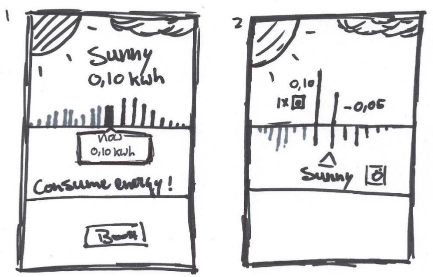
Wireframes
Visual Designs
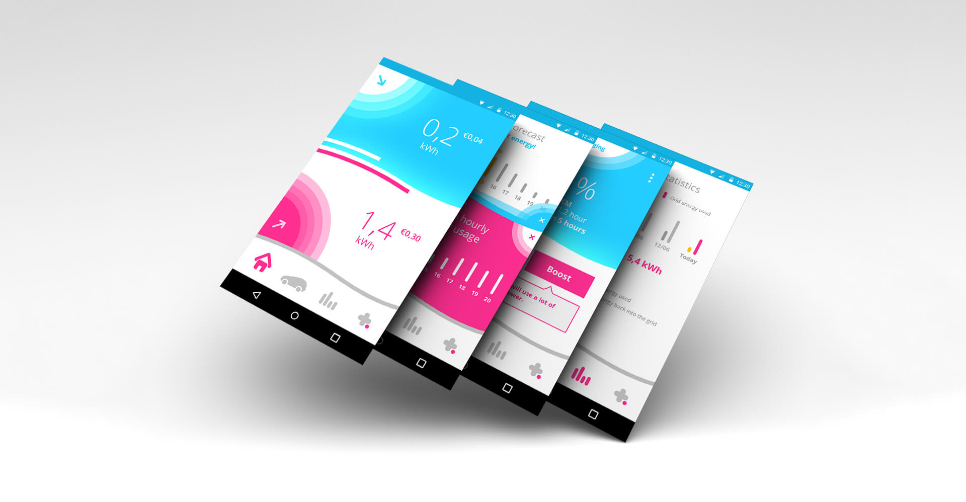
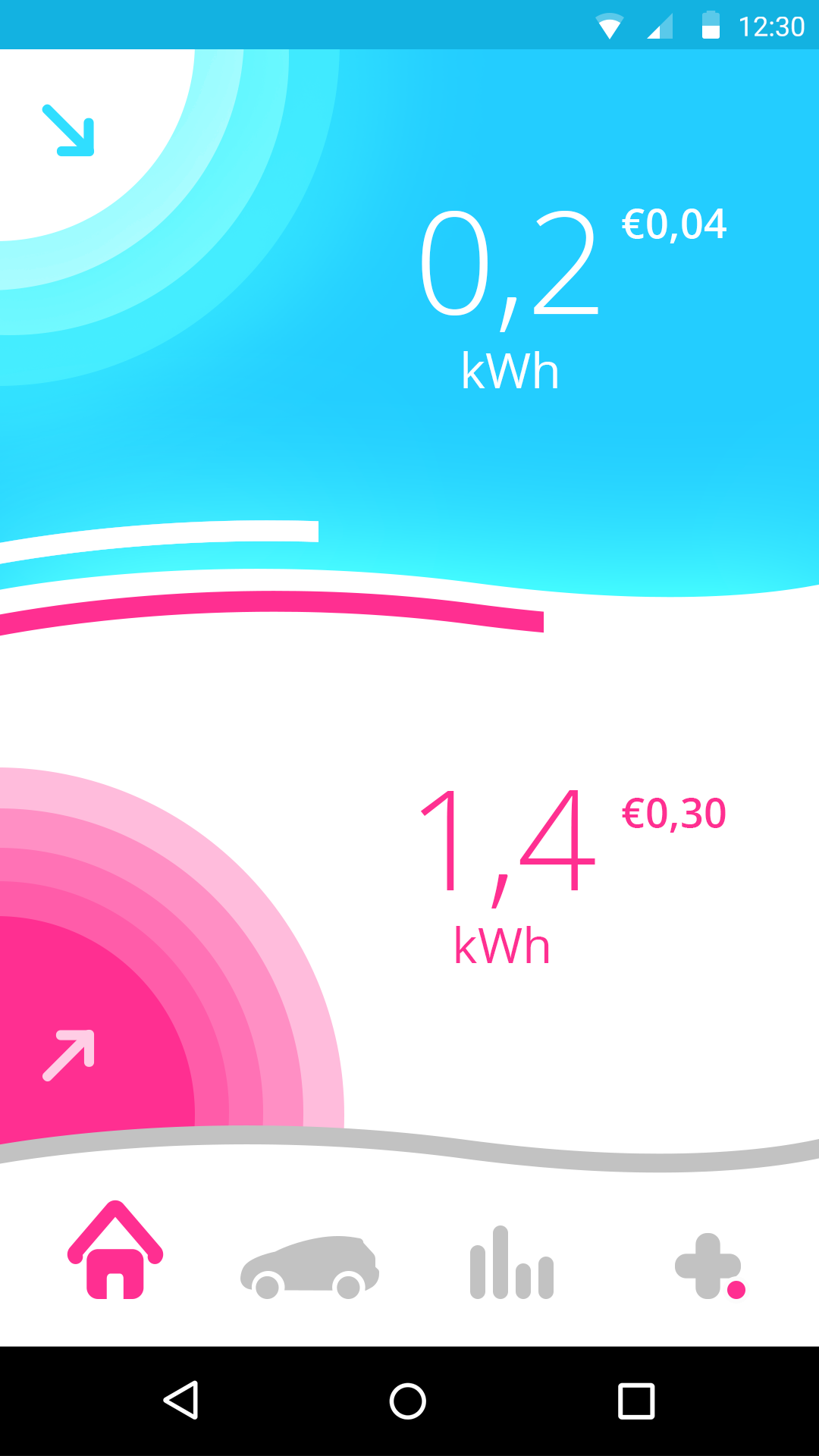
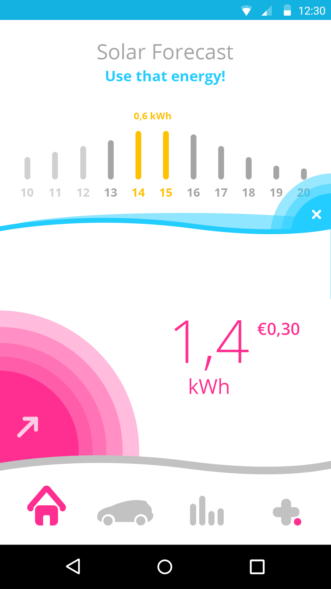
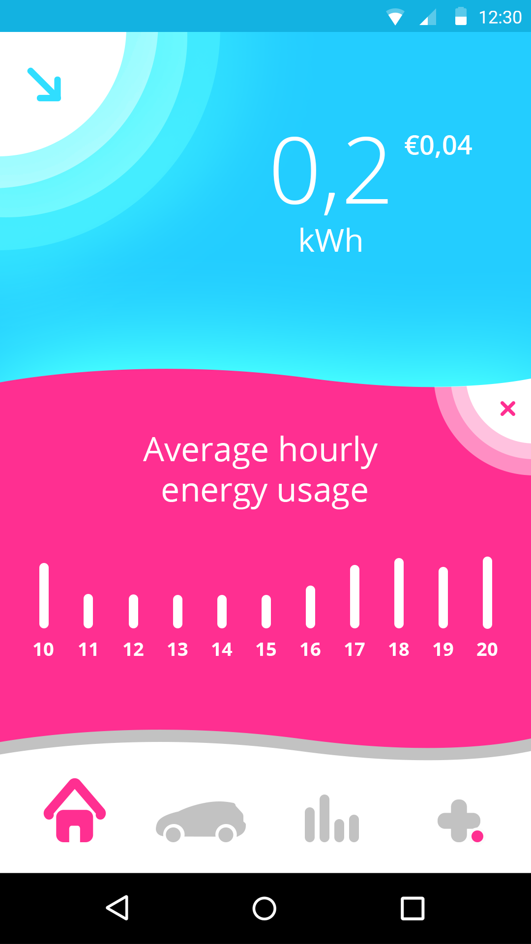
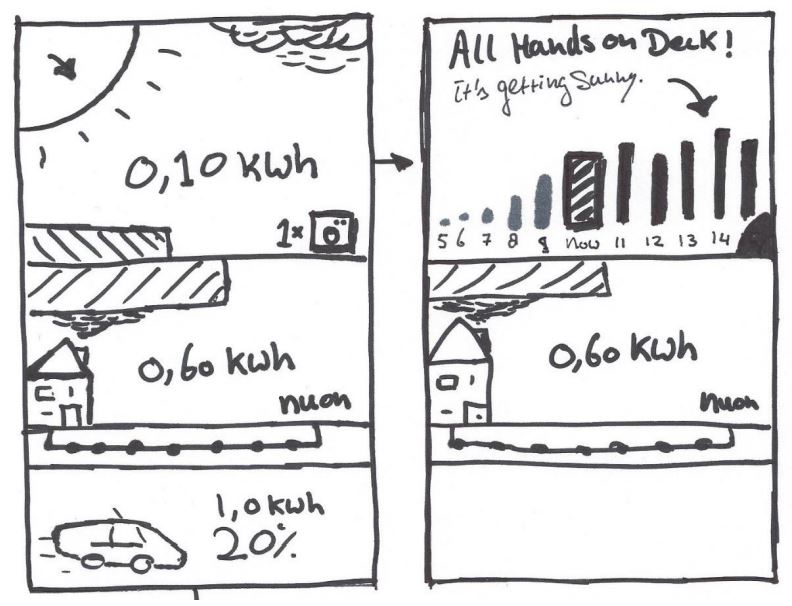
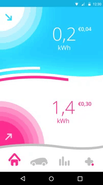
The user can see the incoming solar energy and the energy he/she is using. By dragging the arrows to the right, the user can get more information, like a solar energy forecast and an average energy usage pattern. This data helps the user to plan highly energy consuming activities during sun hours to become 100% sustainable.
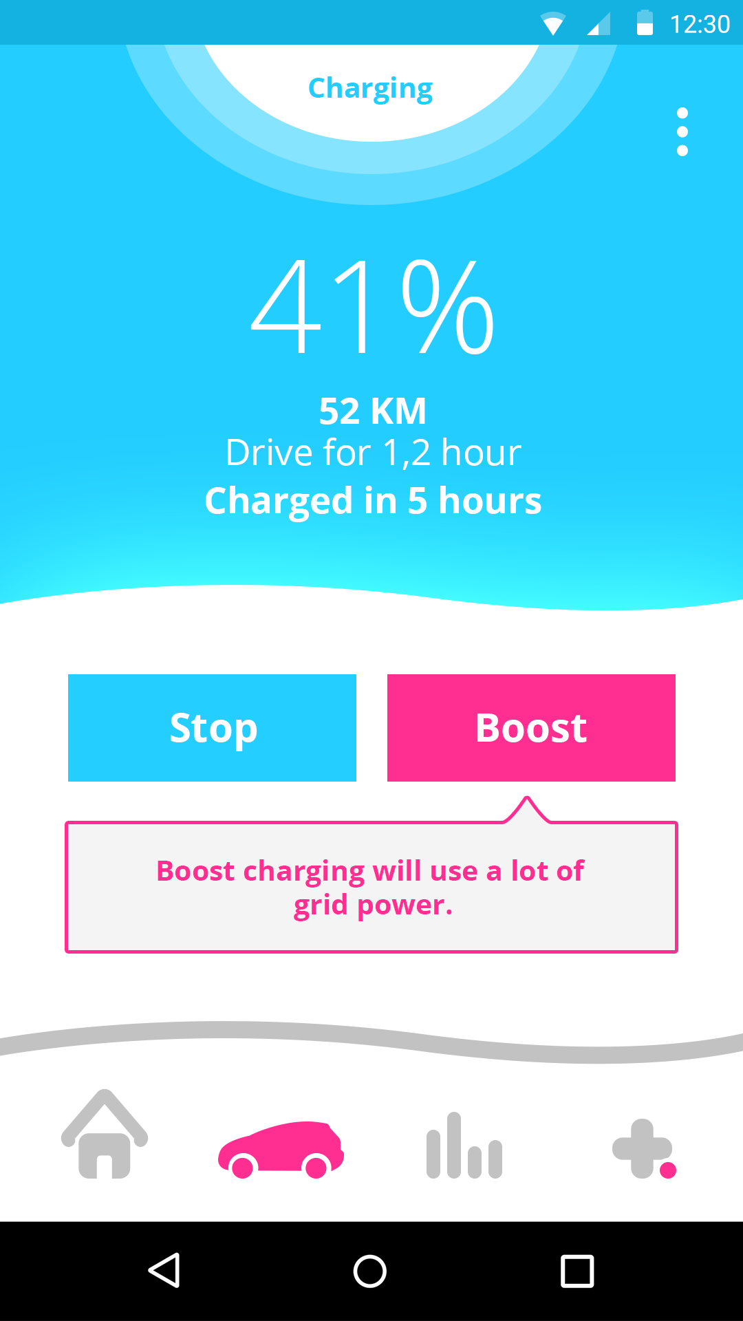
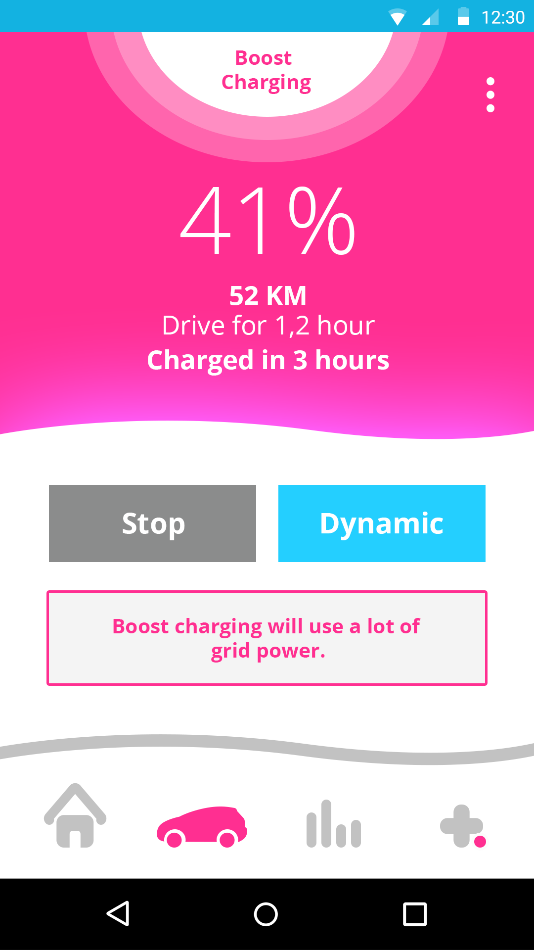
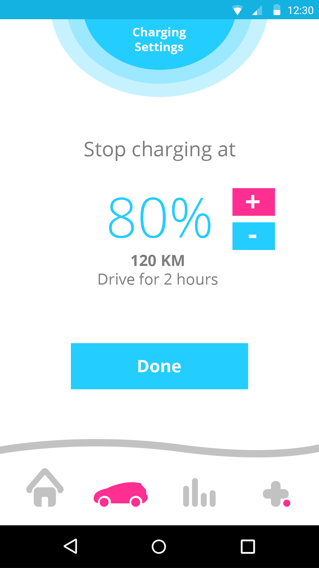
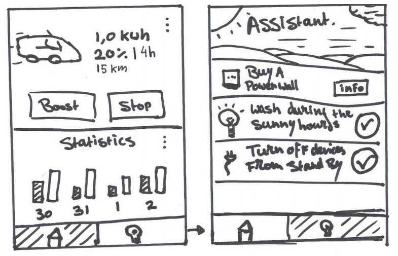
The car screen shows the state of the electric car. It shows the battery life, charging time, settings and an option to boost the charging. But that option will make the user less self-providing.
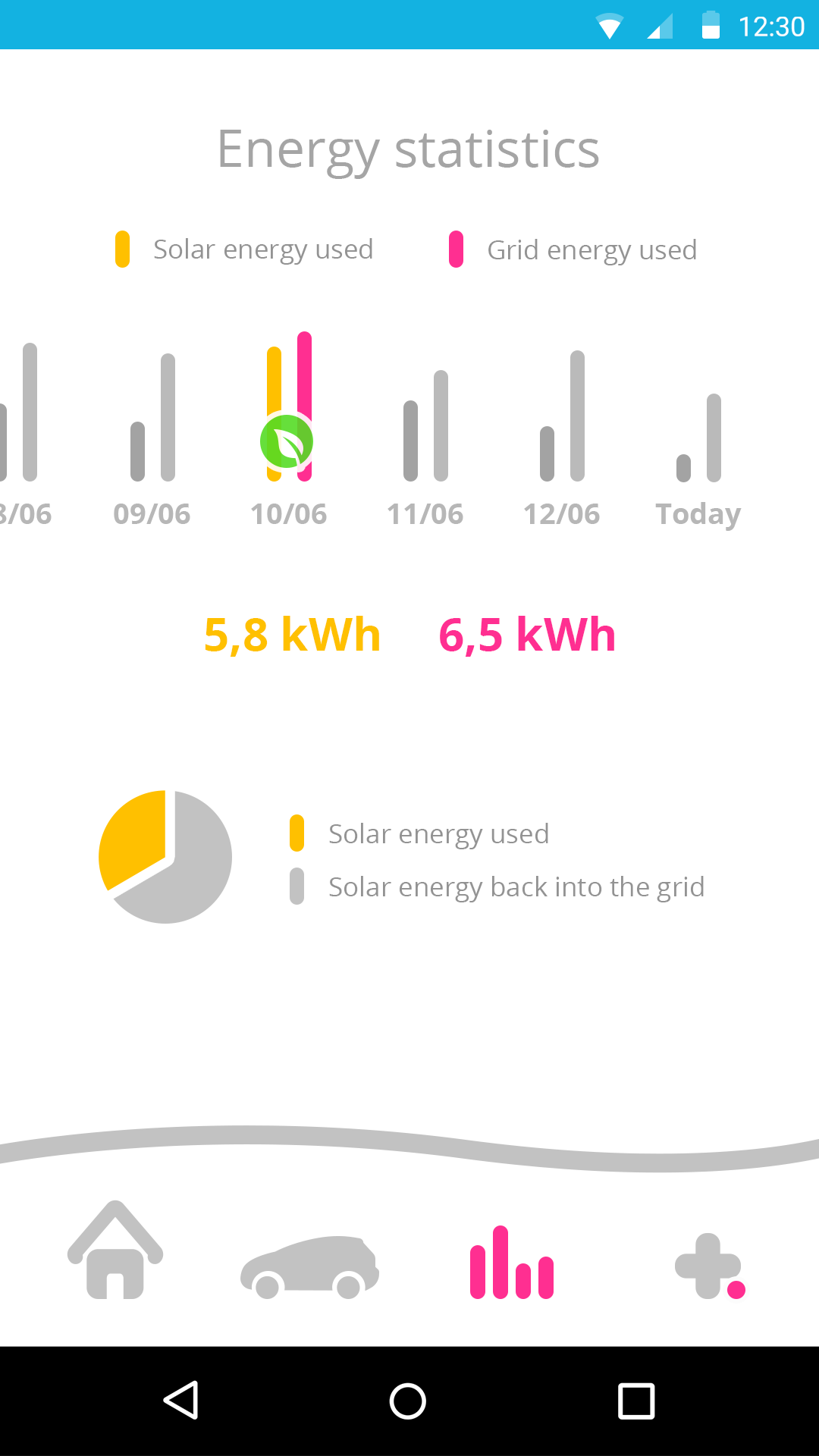
The statistics screen shows how many solar energy was used and how many grid energy was used. It also shows the user how many solar energy from the solar panels went into the grid without using it.
Based on the energy usage of the user, this screen will give feedback on how to become more sustainable and self-providing with energy usage.
Shapes
I want to make the app feel modern and light. Because it’s about sun, light and energy. When thinking about sustainability and sun, I think about organic shapes.
To keep it clean, I use abstract shapes. So the shapes shouldn’t be very detailed, flat and sharp. That’s why I use waves as dividers in the design. The waves can also be interpreted as hills.
Colors
A perfect day to generate solar energy is a day with a light blue sky and a big white sun.
Knowing that, I want to use light blue and white as my key colors. I also want to use a negative color for grid energy, because we want people to barely use that. Red is too heavy for the design, so I went with pink. Okay, it’s also considered the color of love, but it cuts both ways. In this case, pink is the big contrast with blue and white. It’s a heavy color, not a light color.
Early adapters
Early adapters like new and experimental products and designs. That’s why I want to avoid a classic design. So I made it a little playful with the sun and grid bubbles which are interactive.
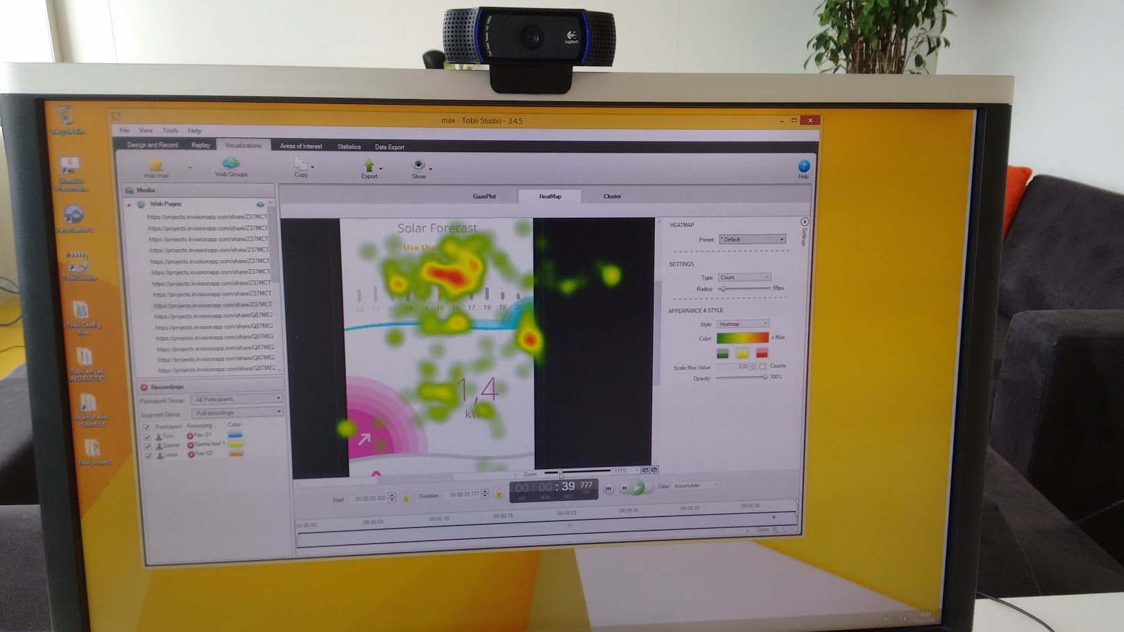
User Testing
I tested my designs in a test lab with eye tracking and think aloud with as many users as I could find.
A computer with eye tracking & gaze mapping software.
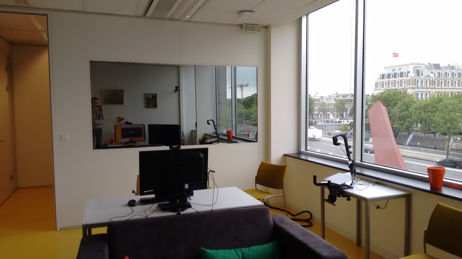
Behind the one sided mirror is an observation room. There are controllable cameras everywhere, built in microphones and big screens. Totally overkill for my project, but it’s a heaven for researchers!
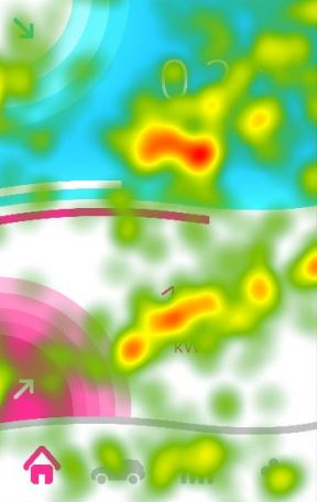
Home Screen
The user’s focus lies on the important information and UI elements. The circles catch attention, as well as the information about them.
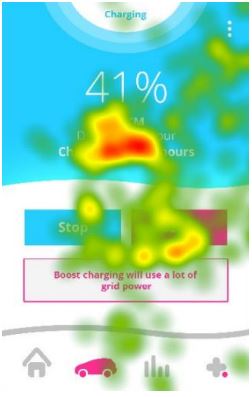
The car screen
What’s interesting to see is that the information below the 41% is read very well. The same can’t be said for the warning under the “Boost” button. So I need to emphasize that more, because users need to know the consequence of boost charging.
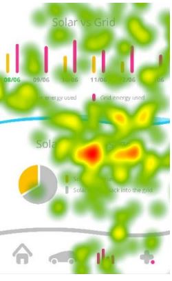
The statistics screen
As you can see, the eyes are all over the place. Is that a bad thing? In this screen, it’s fine. The statistics are meant to be compared and scoured.
However, 1 spot caught my attention. The red spot on top of the text “Solar energy usage”. The big red spot means that people are looking at this title way longer than to any other element on the page. Which means that people could have trouble figuring out the meaning of the title and the meaning of that section. How do I know for sure? I asked them. But that heatmap is cool too, right?
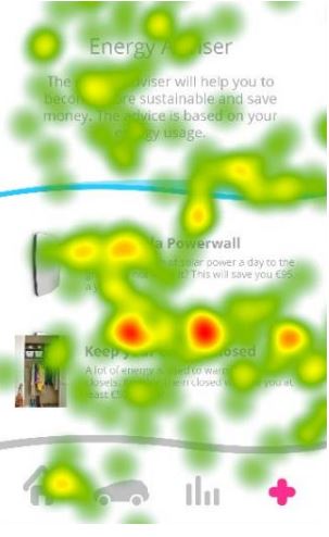
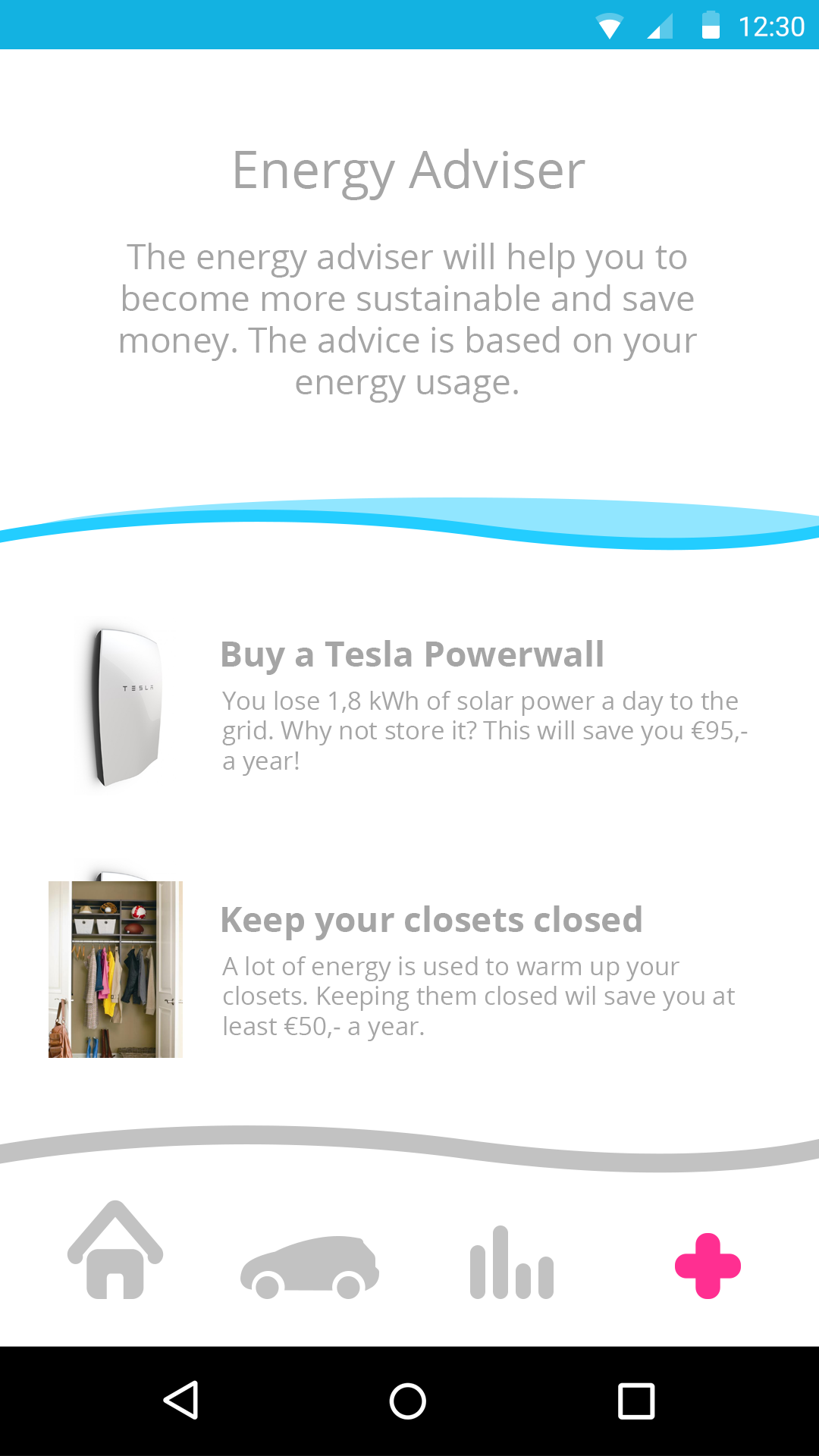
The energy adviser
This heatmap looks good to me. Most of the focus is down at the content. The images don’t seem important, but it’s a nice to have
Motion Design
Sorry for the pixel party! These are the triggers and animations on the home screen, made in after effects.


