UX Redesign increased sales
During my internship at Tele2, I increased sales by improving the User Experience on information pages by analyzing customer journeys and way more cool stuff!About this project
Tele2’s most important information pages weren’t informing the websites visitors enough. Looking at user recordings and heatmaps, you’d see visitors leave the page too soon after searching information they couldn’t find. Most visitors tried getting information about a Tele2 service from the product configurator page, but that was too much.
The Paradox of Choice
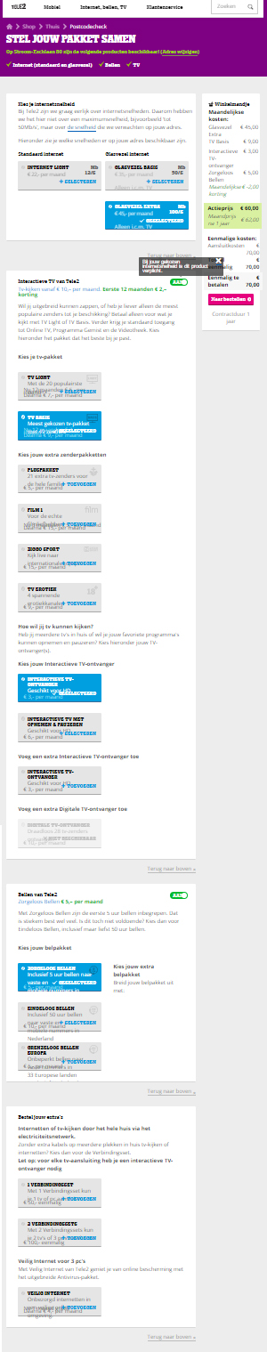
Some people like to have a lot of choice. But in many user recordings, people got confused or were looking for an overview. The image on the left is the configurator page with all the options people can order at Tele2.
The big question: how do we get more conversion?
By making information clearer for potential customers: showing what Tele2 has to offer for which price. I will briefly explain the whole project:
Research
I spent 10 days researching, analyzing and concluding the data that Tele2 had. From heatmaps and recordings to analytics and conversions.
Wireframing & Designing
After this stage, I started using the data to make wireframes and designs. It took 35 days to make the wireframes and final designs of every information page. Okay, I did some projects in the mean time too. But still, 35 days is a long window. Though it wasn’t the designing that took so long, because my biggest challenge was to convince the marketeers to change everything on the page (basically to throw everything away and start from scratch again). Oh boy I made some friends: “Hi, I’m Max the intern and I suggest to completely redesign some of the most important pages on the website”. Well, I backed my opinion up with loads of analytics, so the marketeers approved! After a lot of meetings. But that’s part of a big organization.
Testing
After all the designs have been approved by everyone who could possibly approve anything, I started building my designs in the CMS. Some design elements were a little too ambitious, and couldn’t be built by the developers team due to a short time frame. So I developed it myself with HTML, CSS and some jQuery (proud moments, I can tell you!).


Customer Journeys
Those customer journeys were based on personas I created from the target audience


Sketching and wireframing

I wanted to show the three most assembled plans that customers of Tele2 had ordered. A light, medium and large plan with different internet speeds, Television subscriptions and phone subscriptions.
Design iterations of the plans
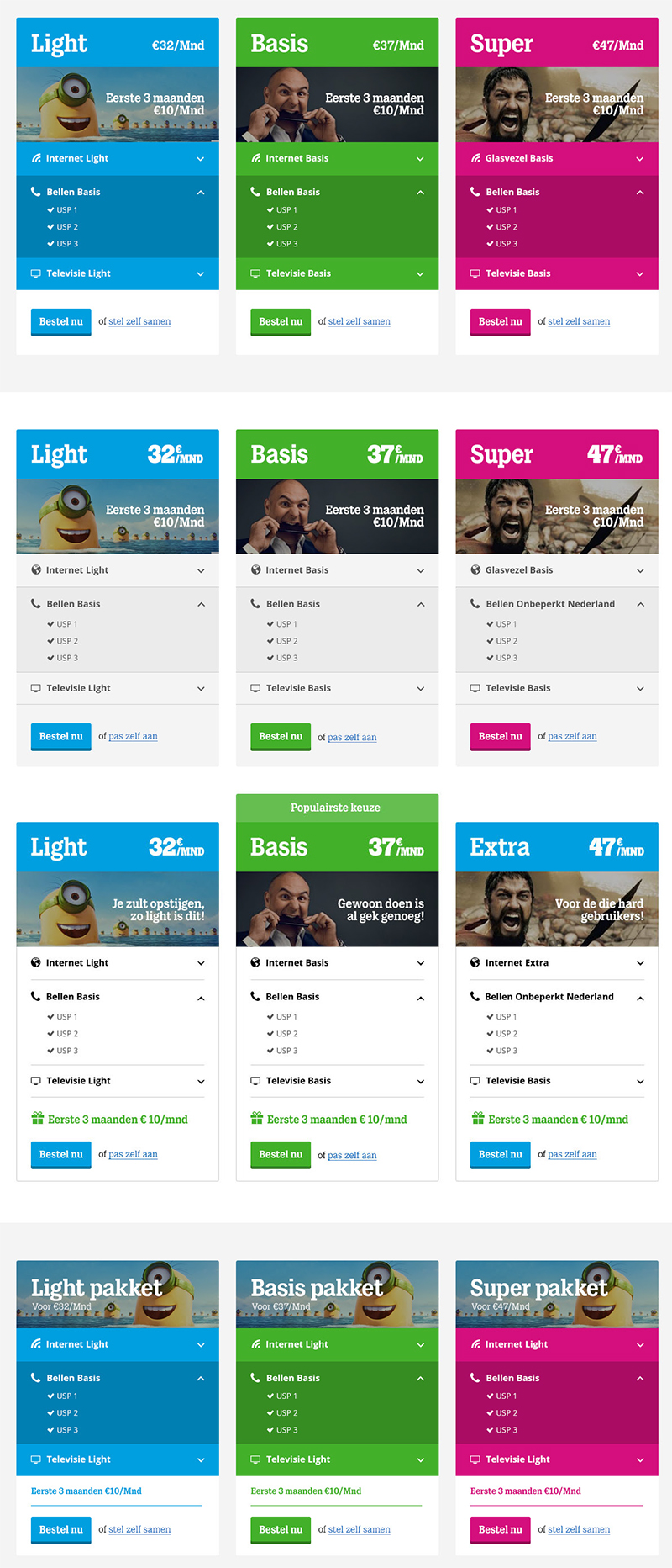
After sketching and wireframing a rough setup, I started designing! And I started a little too fancy.. The first design was too heavy on color. The style of Tele2 was already quite heavy, so it started to look like a rollercoaster. While dodging the critique on my minion as placeholder, I designed a lighter version of the plans. My colleagues liked it, but wondered if totally white would look better, so I made a totally white design too. Eventually, the white design won (although I still like my first fancy design the most, but don’t tell anyone. It’s between you and me).


